Real-time social events experience
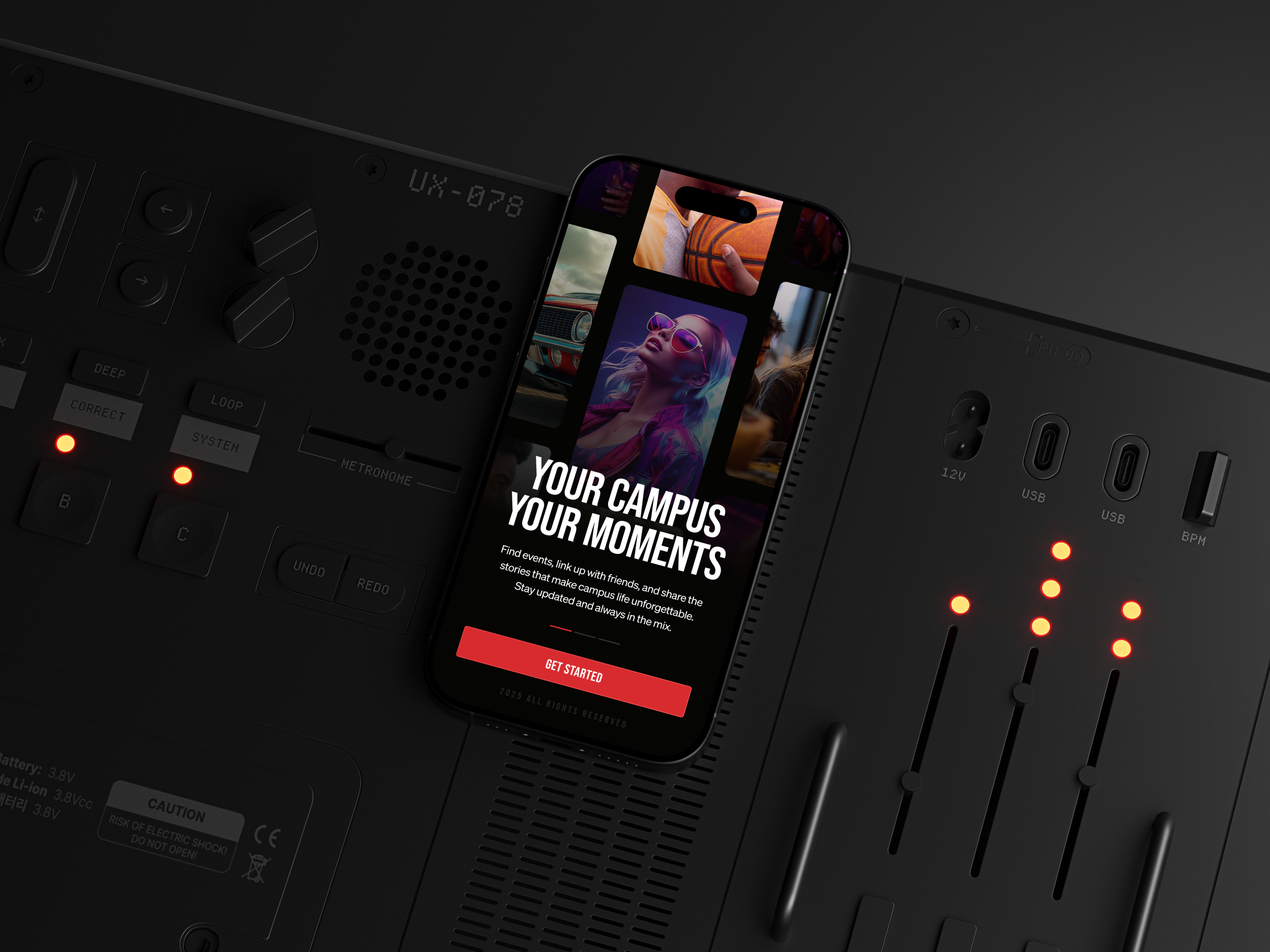
KiccBacc is a social events platform designed for students and young adults who make plans fast and decide based on people, vibe, and momentum. The product blends three behaviours into one experience: discovering what’s happening now, sharing moments through stories, and coordinating privately through messaging.
The goal of this case study is to show how I structured the UX around real-world social behaviour—reducing the gap between “that looks fun” and “I’m going”—while building a visual system that supports fast scanning in low-attention environments.
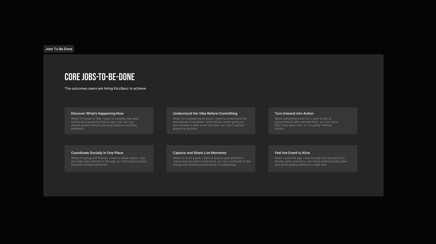
Most event apps are built for browsing and planning, but real student behaviour is spontaneous and socially driven. Users don’t want to read through long listings - they want to understand in seconds what’s worth their time right now.
KiccBacc needed clearer social context (who’s going, what’s the vibe), a faster path from discovery to action, and in-app coordination so users don’t have to jump into external chats to make a decision.
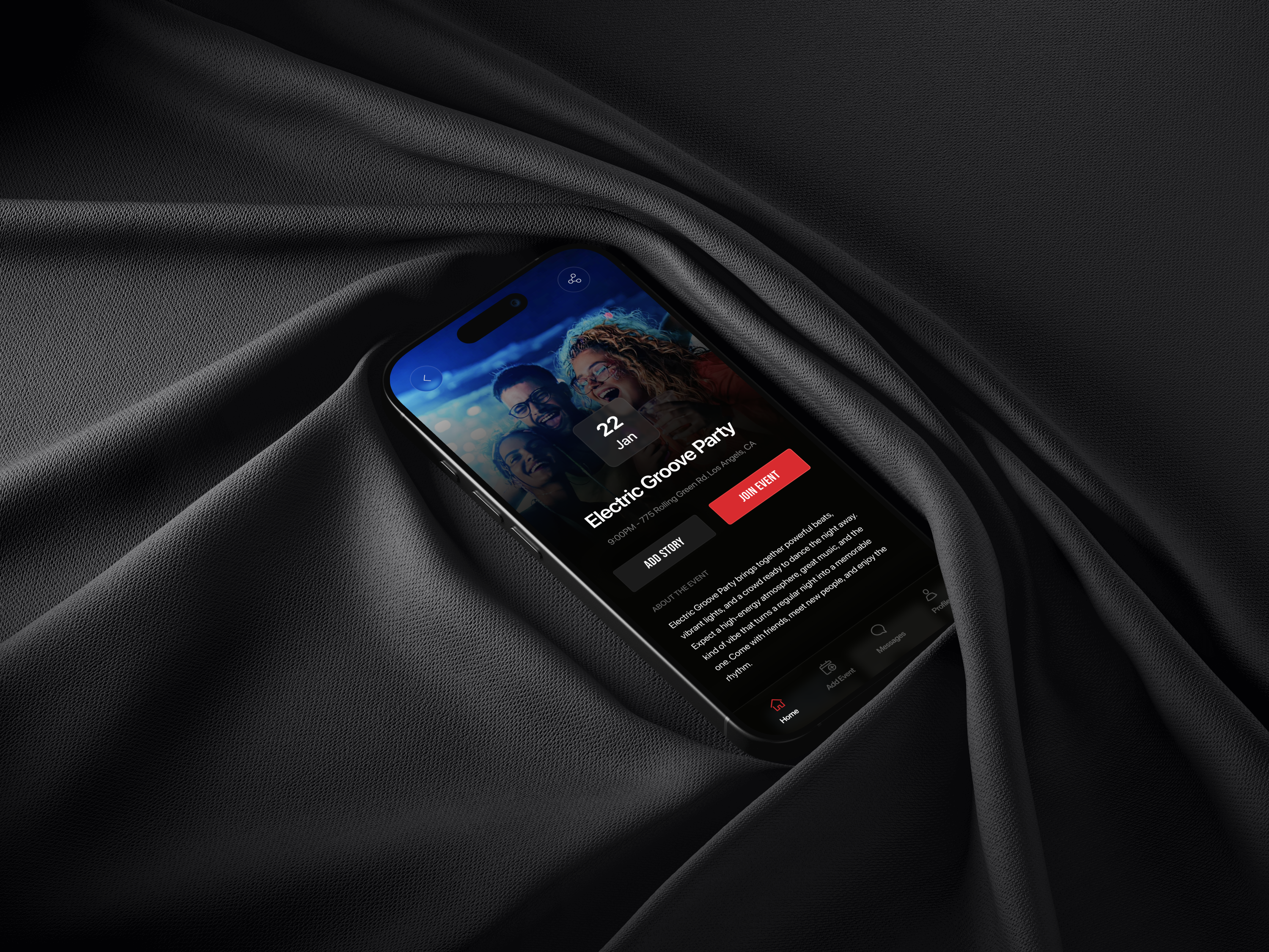
We reframed events as live social moments rather than static listings. The experience is built around real-time discovery, story-first context, and clear actions that shorten the decision loop: see what’s happening, understand the vibe, and join with minimal friction.
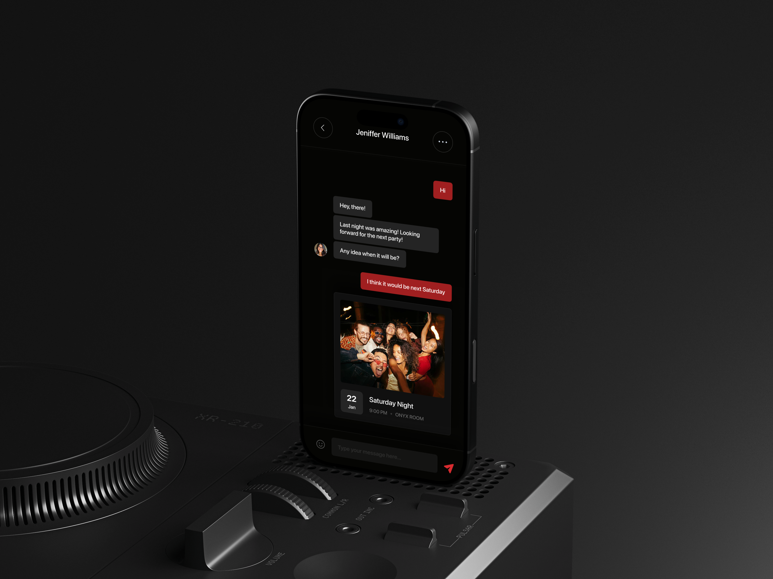
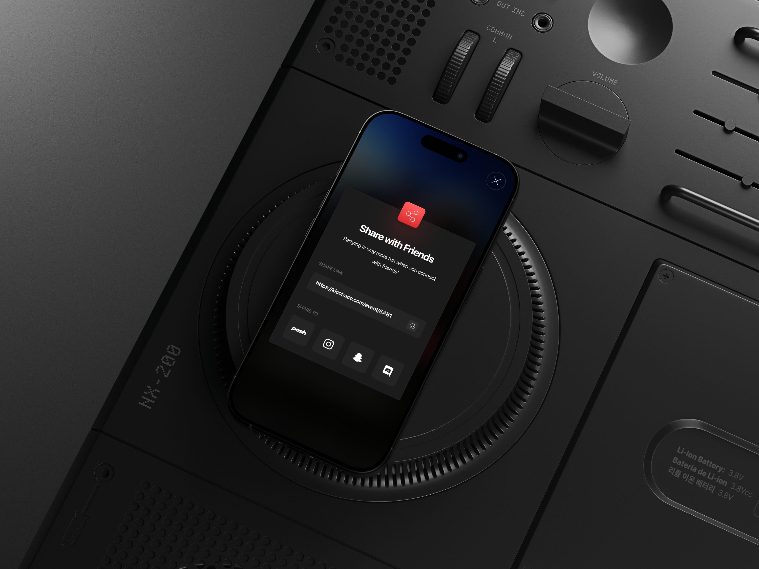
By integrating event sharing directly into messaging, KiccBacc supports the way groups actually coordinate. Instead of sending links and screenshots elsewhere, users can discuss an event in-context and turn interest into attendance faster.
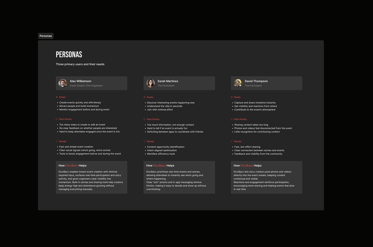
I gathered early input through short surveys and informal interviews with students to understand how they decide to attend something in real life. The strongest pattern was consistent: people don’t commit because of details—they commit because of social proof, vibe, and timing. This research informed the personas and the content hierarchy across events, stories, and messaging.
To validate positioning, I reviewed both event-focused products and social platforms. Event apps tend to prioritise structure and information, but they rarely communicate real-time energy. Social apps are great at capturing moments, but they don’t turn intent into coordinated attendance.
This gap created a clear opportunity: a product that keeps the immediacy of stories while giving users decisive actions like “Join”, “Invite”, and “Share to chat”. The aim was not to add more features, but to combine the right behaviours in the shortest possible loop.
I mapped common patterns across competitors—feeds, cards, story modules, and sharing—then aligned KiccBacc’s UX to what users already understand while reserving differentiation for social context and real-time signals.
These findings guided the hierarchy of information on event pages, the structure of the stories experience, and the decision to support in-app coordination as a first-class flow.
Stakeholder input helped keep the scope focused on what moves behaviour: discovery clarity, social proof, and reduced friction from interest to action.
Below are a few representative snapshots that capture the competitive gaps and the direction we used as a baseline.
The resulting UX concept supports faster decisions and stronger social participation by making real-time context visible. Instead of forcing users into heavy planning, KiccBacc helps them scan, understand the vibe, and act quickly.
Stories provide immediate “proof of life”, event pages prioritise the information users actually need to decide, and messaging enables coordination in-context. The experience reduces the common drop-off between discovery and attendance.
From a product perspective, the redesign positions KiccBacc as a social layer around real-world moments rather than a catalogue of listings. That distinction is what creates a clearer identity and a more engaging daily-use loop.
This project is intentionally designed to evolve through iteration as usage patterns emerge, with the goal of continuously tightening the decision loop and improving clarity across discovery, sharing, and joining.
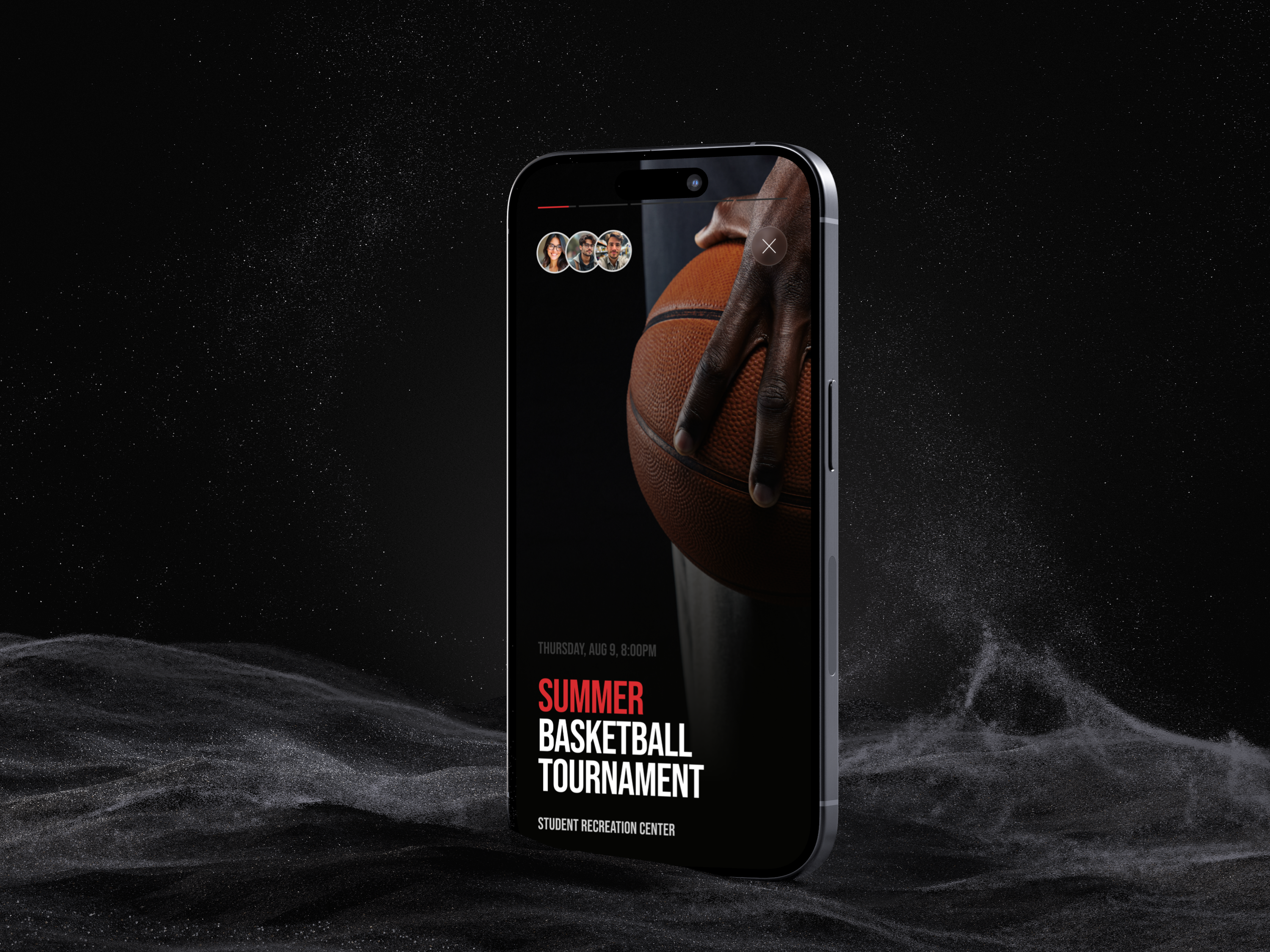
The interface is designed for fast scanning in low-attention contexts. Large media, strong hierarchy, and clear calls to action help users decide quickly while keeping the experience visually energetic and social.
Events, stories, and messaging share consistent patterns (cards, chips, and actions) so users can move between modes without re-learning the UI. The dark theme supports media-first content and fits naturally into nightlife and campus settings.
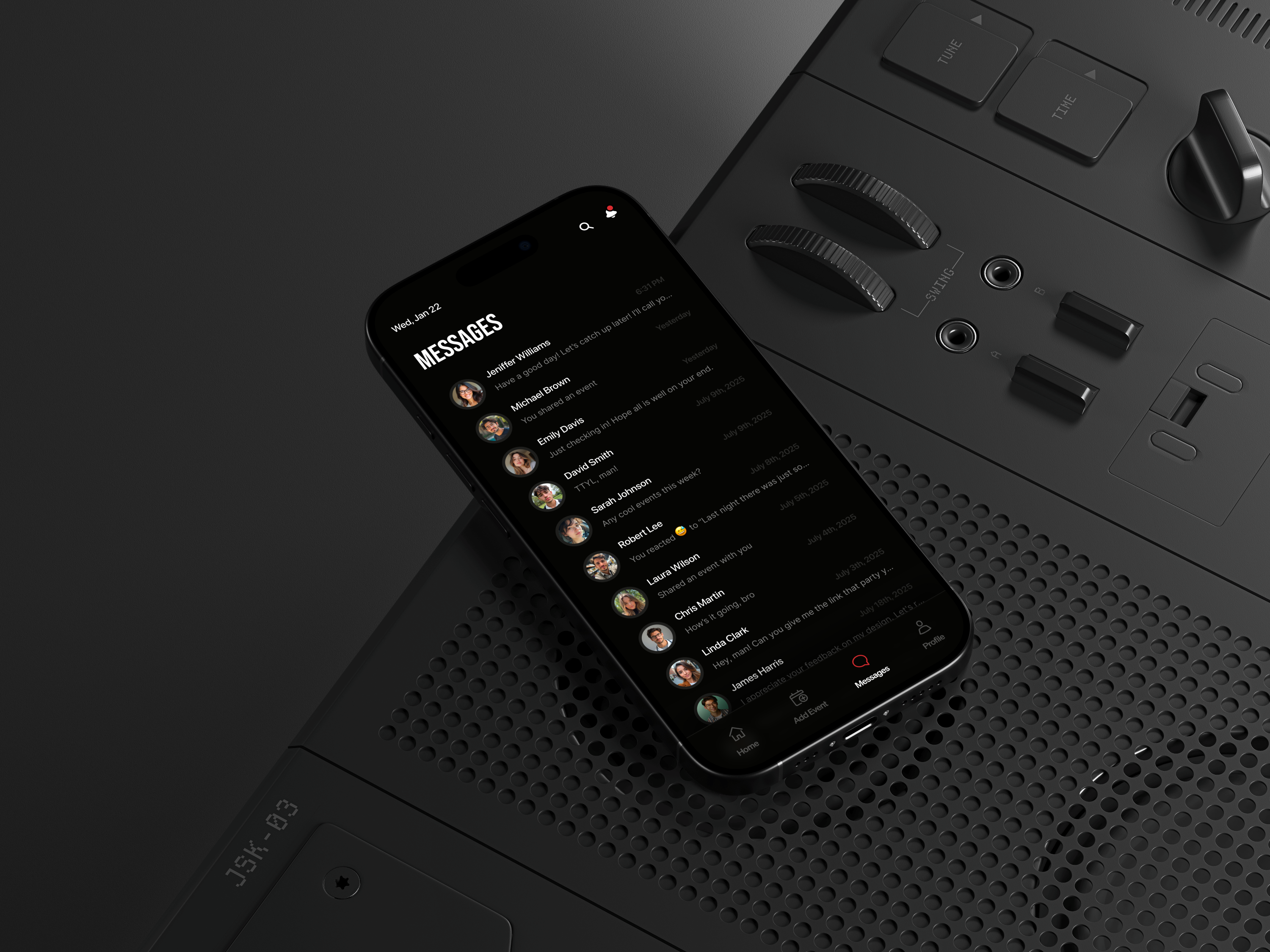
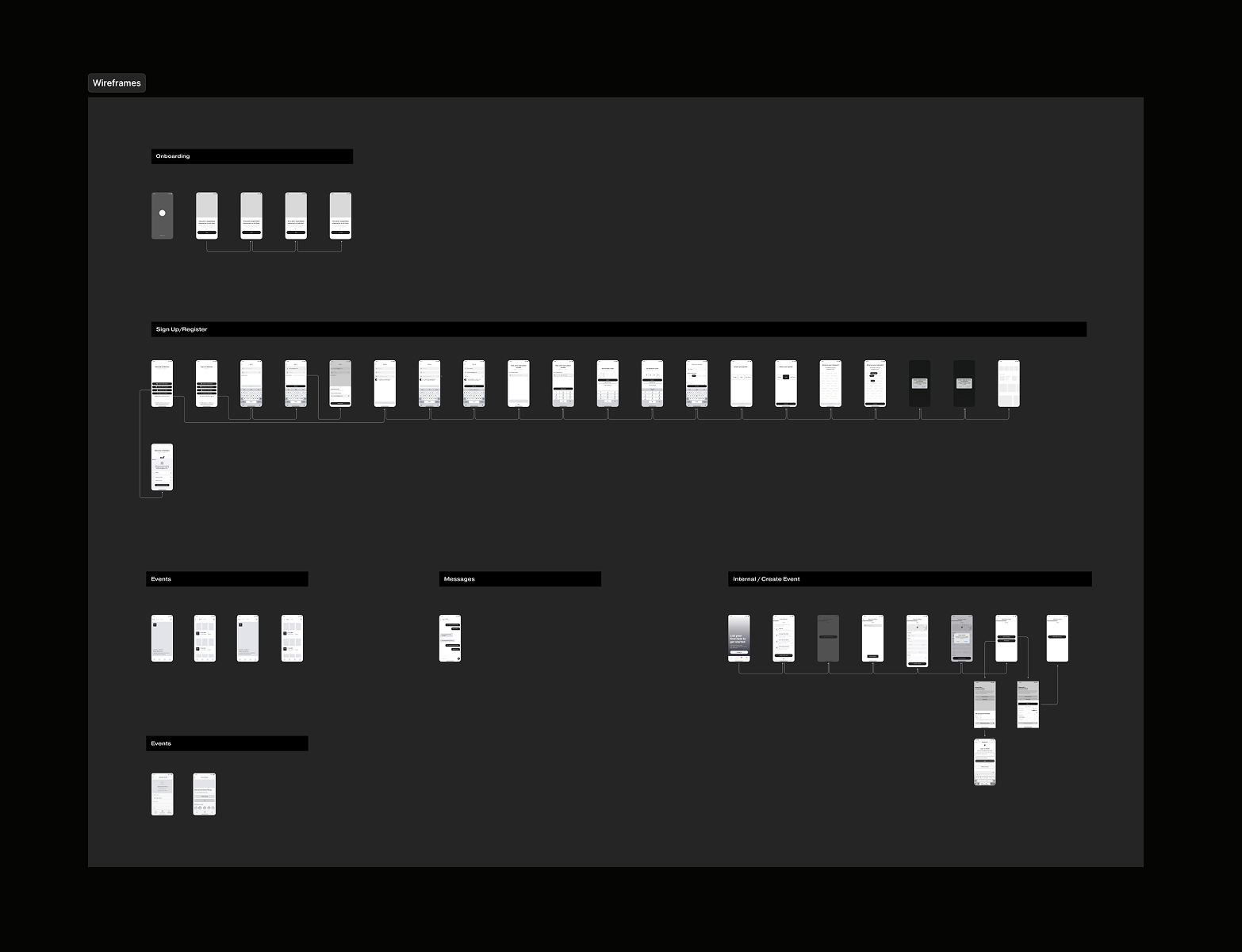
A lightweight design system was created to keep the product consistent while allowing future growth. Core components such as event cards, story modules, chips, buttons, and typography scales were standardised to support quick scanning, predictable interactions, and a cohesive visual identity across discovery, event details, and messaging.
AI Powered Analytical Tool